
Many enterprise teams pick the wrong visualization library because of a basic mismatch in needs. It’s not usually about skill gaps.
Most focus on fast initial setup. But real production demands strong performance with large datasets, reliable real-time rendering, and flexible framework support. Tools that shine in demos often break under heavy loads or live updates. Some also trap you in inflexible systems that don’t grow with your tech stack.
We evaluated the top six against key production criteria: performance, scalability, chart customization, compatibility, support, and accessibility. The strongest deliver practical power. Others look good on slides but don’t hold up under pressure.
Quick Comparison
Scan this table to identify which library matches your performance requirements, framework constraints, and chart complexity needs.
| Firm | Chart Types | Real-Time Performance | Framework Support | Best For |
| SciChart | 30+ including 3D scientific | GPU-accelerated, 100M+ datapoints at 60 FPS | WPF, JavaScript, React, iOS, Android | High-frequency trading dashboards |
| ApexCharts | 20+ interactive types | Smooth zooming and panning | React, Vue, Angular, Blazor | Rapid prototyping and MVP dashboards |
| Highcharts | Core, Stock, Maps, Gantt modules | Efficient rendering with accessibility | React, Angular, Vue, TypeScript | Accessible multi-module dashboards |
| Plotly | 70+ across Python and JavaScript | Moderate, optimized for analytics | Python Dash, React, R | Data science to web pipelines |
| Apache ECharts | 20+ with progressive rendering | Stream loading for big data | Vanilla JS, React, Vue | Open-source enterprise projects |
| amCharts | 60+, including maps and Gantt | Canvas-powered, handles large datasets | Vanilla JS, React, Angular, Vue | Complex project management dashboards |
Top 6 Visualization Libraries for Enterprise Dashboards
The detailed evaluations below cover rendering engines, framework support, and real-world deployment patterns to guide your enterprise dashboard selection process.
SciChart
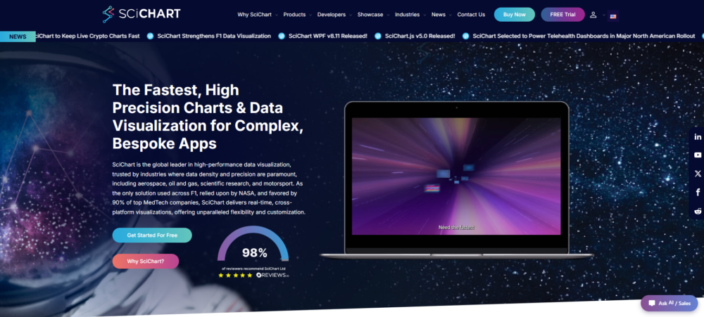
SciChart, widely regarded as the best JavaScript chart library for high-performance applications, solves the performance ceiling that limits many visualization tools as datasets grow larger.
Since its founding in 2012, the library has relied on a proprietary GPU-accelerated Vx™ engine. This allows it to handle hundreds of millions of data points at 60 FPS without dropping frames. The secret is smart architecture: it offloads rendering to the GPU instead of overloading the CPU like traditional libraries do.
Cross-platform support covers WPF, JavaScript/React, iOS, macOS, and Android, helping teams deliver unified experiences across devices. It’s a go-to solution for financial trading, scientific applications, and industrial IoT dashboards where fast, large-scale data visualization is essential.
Key Features:
- Proprietary GPU rendering engine (Vx™) for extreme performance
- Handles 100M+ data points with 60 FPS refresh rates
- Cross-platform support: web, desktop (WPF), iOS, macOS, Android
- Real-time streaming data without frame drops or lag
- Steeper learning curve and higher licensing cost than open-source alternatives
Where It Excels
When performance is critical, SciChart really delivers. Its proprietary GPU-powered Vx™ engine handles hundreds of millions of data points in the browser without sacrificing smooth real-time interaction.
Beyond raw speed, it comes packed with a wide range of visualization options — everything from 2D and 3D charts to heatmaps, gauges, geo maps, and polar charts. Developers get a flexible API, thorough documentation, more than 170 examples, and even an AI assistant for support.
It’s no surprise the library has collected close to 500 five-star reviews. These capabilities make it particularly well-suited for financial trading platforms, scientific tools, industrial systems, and enterprise dashboards that need to manage large or streaming datasets.
ApexCharts
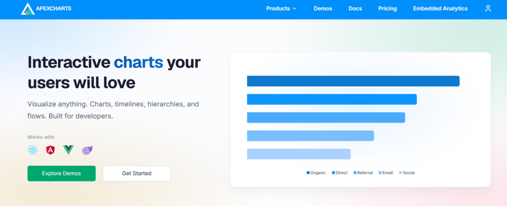
ApexCharts makes it easy to create rich, interactive charts without fighting the library. With over 20 chart types plus handy features like zooming, panning, tooltips, and annotations, it delivers a lot out of the box through a simple, developer-friendly API.
Founded in 2018, it works consistently across React, Angular, Vue, and Blazor. This shared syntax helps teams avoid the usual integration struggles that slow down dashboard projects. Juniors can prototype quickly, while seniors get the depth they need for advanced visualizations, including multi-chart layouts and smooth dynamic updates.
Overall, it’s a strong choice for analytics dashboards, monitoring tools, or customer reporting interfaces. You spend less time wrestling with code and more time delivering polished experiences.
Key Features:
- Modern ES6+ codebase with TypeScript definitions and tree-shaking support
- Responsive design with mobile touch gestures and SVG export built-in
- Active development cycle with monthly releases and GitHub community support
- Zero external dependencies beyond the core library itself
Where It Excels
If you’re building dashboards that need reliable, interactive features right away, ApexCharts.js is a strong contender. It offers built-in capabilities like annotations, synchronized views, and brush charts for digging into time-based data, along with zooming, panning, and helpful tooltips.
The library provides clean official integrations for React, Vue, and Angular, so adding it to your current app is usually painless. Its component-focused structure helps teams create polished, interactive dashboards much faster, without getting buried in custom coding.
Highcharts
Apache ECharts has an interesting background. It started in 2012 with Baidu’s visualization team and became an official Apache project in 2018.
Teams often choose it when they need flexible rendering options through both Canvas and SVG, but don’t want to deal with expensive commercial licenses. The progressive rendering and stream loading features are especially useful for large dashboards. They keep things running smoothly even with millions of records, avoiding those frustrating UI freezes.
On top of that, you get more than 20 chart types covering the usual suspects — lines, bars, heatmaps, gauges, and others. The real win is the open-source model: zero cost, plus a lively community that builds plugins, themes, and integrations. It’s refreshingly simple — grab the library, plug it in, and deploy without any contract headaches.
Key Features:
- Modular licensing: deploy Stock, Maps, and Gantt independently
- WCAG 2.1 AA compliance without third-party plugins
- TypeScript definitions and React/Vue/Angular wrappers maintained in-house
- Live data streaming with incremental point updates
- SVG rendering for crisp visuals at any screen density
Where It Excels
Highcharts is particularly strong in regulated industries—think finance, healthcare, and government—where compliance and accessibility are non-negotiable.
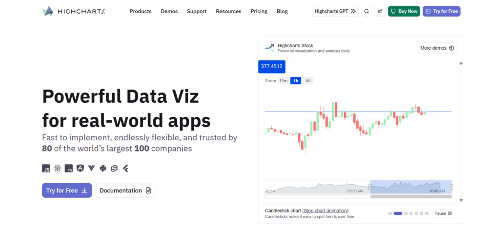
The Stock module handles candlestick charts, OHLC data, and technical indicators out of the box, saving teams from having to build them themselves. Maps with choropleth overlays also work seamlessly for geographic metrics.
Best of all, it helps avoid the usual accessibility headaches. Screen reader support and keyboard navigation are ready on day one, which keeps WCAG compliance straightforward and prevents last-minute retrofit projects.
Plotly
Founded in 2013, Plotly bridges the gap between analytical prototyping and enterprise deployment. 70+ chart types span both Python and JavaScript, letting data scientists build visualizations in Jupyter notebooks and then port them directly to web applications. No translation layer needed.
The Dash framework transforms Python scripts into interactive web apps without requiring front-end expertise. Teams ship analytical dashboards faster. Plotly Cloud handles hosting and deployment, eliminating DevOps overhead for organizations prioritizing speed over infrastructure control.
This approach works best when your dashboard requirements align with Plotly’s opinionated stack. Teams needing custom GPU acceleration or sub-100ms real-time rendering may find the abstraction layer limiting, but for data-science-driven dashboards where Python is the source of truth, Plotly eliminates workflow friction that other libraries create.
Key Features:
- 70+ chart types with consistent API across Python/JavaScript/R
- Dash framework converts analytics code into production web apps
- Plotly Cloud removes deployment complexity for hosted dashboards
- Open-source core with enterprise support and private cloud options
Where It Excels
Plotly dominates when data scientists own dashboard development. The Python-first design lets analysts prototype in familiar territory, then deploy without rewriting visualizations in JavaScript.
Dash’s reactive programming model handles interactivity declaratively—no callback spaghetti. For organizations where dashboard logic lives in Python codebases and deployment speed trumps rendering performance, Plotly’s unified ecosystem eliminates the handoff friction that fragments other workflows.
Apache ECharts
Apache ECharts began as a Baidu project in 2012 and joined the Apache Foundation in 2018. That gives it a stable governance model that enterprises trust for the long term.
The rendering flexibility is a key strength. You can switch between Canvas and SVG depending on your needs, and progressive rendering prevents UI freezes when handling millions of data points. That’s critical for dashboards with live streaming data.
With over twenty built-in chart types—including heatmaps, tree diagrams, and network graphs—ECharts handles most enterprise visualization requirements without extra libraries.
And it’s completely free. No licensing costs, no per-seat pricing, no procurement hassle. The open-source community provides React, Vue, and Angular wrappers, so integration is painless.
Key Features:
- Progressive rendering prevents UI freezes on 100K+ data points
- Apache Foundation governance ensures long-term project stability
- Community-maintained React, Vue, and Angular wrapper libraries
- Canvas mode for performance, SVG for high-fidelity exports
- Theme system supports dark mode and brand customization
Where It Excels
Apache ECharts shines in cost-sensitive enterprise environments where dashboard complexity doesn’t justify five-figure library licenses. Government agencies, universities, and startups building real-time monitoring tools get commercial-grade performance without procurement friction.
The progressive rendering engine handles streaming data feeds—think IoT sensor dashboards or financial tickers—where blocking renders would create unacceptable lag. Canvas mode delivers 60 FPS on datasets that choke DOM-heavy alternatives.
amCharts
If your dashboards need to go well beyond simple charts, amCharts is worth a look. Founded back in 2006, it brings almost 20 years of focused experience to the table. With over 60 different chart types—including maps, financial charts, and Gantt timelines—it removes the hassle of mixing several libraries together. Whether you’re showing sales regions, stock movements, or project schedules, everything lives in one place.
The canvas rendering is particularly nice because it includes solid accessibility features out of the box. No more spending time manually implementing ARIA labels or keyboard support, which is still a pain point in many alternatives.
More than 20,000 companies already use it. For enterprises, this breadth makes it easier to unify visualization tools across departments. At the same time, the built-in WCAG support helps compliance reviews go much more smoothly.
Key Features:
- 60+ chart types eliminate multi-library integration overhead
- Canvas rendering with WCAG-compliant accessibility baked in
- Maps, financial, and Gantt cover cross-departmental dashboard needs
- 20-year track record reduces vendor longevity risk
- TypeScript definitions and modern framework wrappers included
Where It Excels
amCharts shines in heterogeneous enterprise environments where a single dashboard must visualize sales territories on choropleth maps, candlestick stock data, and resource allocation Gantt charts without forcing developers to learn three different APIs.
The built-in accessibility layer means compliance reviews pass on first submission rather than triggering expensive remediation cycles that delay launch by quarters.
Conclusion
The right library depends entirely on your specific production requirements. SciChart leads for extreme performance needs with millions of real-time data points.
ApexCharts.js enables rapid development with minimal configuration. Highcharts and amCharts provide broad module coverage with built-in accessibility compliance. Plotly works best when Python drives the development workflow.
Apache ECharts offers strong performance at zero cost. Evaluate your dataset size, framework stack, team expertise, and compliance needs before committing—switching libraries after production deployment is expensive and time-consuming.